Measurement, monitoring and evaluation is how we understand:
- what is happening
- how effective our work is
- how we can inform learning to evolve and improve our services
Be curious with data
Being curious about what data and information is telling you helps you to navigate what changes are needed, and how well your change efforts are going.
The data you choose, how you cut it, and what you combine it with can shape your change programme’s direction. Curiosity about data grows in a culture that encourages open questions. This culture helps people explore the data used in decision-making.
Making meaningful comparisons
When comparing yourself to other services or geographical areas, think about whether that is a useful comparison to make. If something important can’t be changed (like population size) try looking at areas with similar population size. Be curious to what is making the difference and then you can see what the differences are that you can change. What ‘good’ and ‘bad’ numbers look like for a part of Glasgow is likely to be different to Orkney.
Trying to understand why another area has got it ‘right’ and you have not, based on the numbers, can set you up to pursue the wrong thing, or set you up to fail due to circumstances outwith your control.
Choosing the right time period
How you choose the time period you look at matters. You may see an increase in something but look over a longer time period to check whether is just things going back to normal.
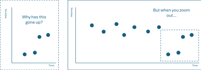
The image above shows how changing your perspective can lead to a different finding.
The length of time you choose to look at data over matters too. If you are looking at data daily, weekly or monthly it can be unhelpful if the pattern has expected annual cyclical patterns or where significant changes expected within a short timeframe is unexpected.
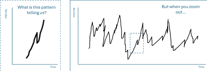
The image above shows how data should be seen in a broader context of change.
Question how the data is presented
If the numbers are presented in percentages, look at the actual numbers as well (denominators). This helps to get a better understanding.
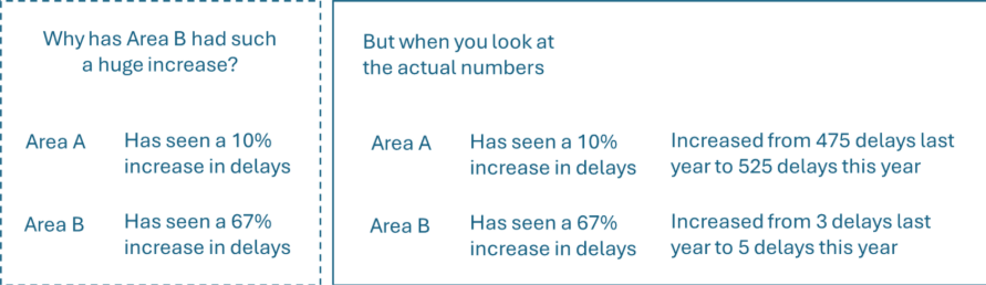
The image above shows why you need to understand data beyond the headline figure.
Triangulating data for deeper insight
How can you combine different kinds of data and information to see a fuller picture? Thinking across several types of data is called triangulation. This is very important in change. For example, triangulating what the evidence or performance data shows, and what staff, patients, service users, communities and lived and living experience say. This can give you more understanding about the best change you can make.
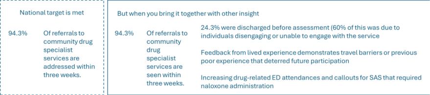
The image above shows the insights created through a combination of different data sets.
Keep an eye out for data points that are potentially an anomaly (or an ‘outlier’)
Outliers can distract from the overall message the data is telling us. Identifying outliers is often a judgement call. It can be helpful to talk about the data with others to get a shared view on what may or may not be an outlier.
Keep an eye out for a trend in the data
A trend usually emerges after you have enough numbers above or below the average in a row. This helps you know if the change you have made has a lasting impact. For example, with monthly data something might improve for a month or two, but then might fall back – you could only say something has an upwards trend if its above average for over five months.
Presenting data
Think about whether the data should be presented differently to avoid it being confusing or misleading.
Avoid using pie charts – they can become confusing to interpret accurately when you have more than two categories in the graph. They are also less accessible for people with vision challenges (like colour blindness). Displaying data in bar charts. Order the bars from highest value to lowest.
Keep it simple – think about what data you are putting in one graph or chart to show one key message. It will be confusing if you try to show too much at once.
Use colour well – to show contrast or connect across a series of graphs. For example, use the same colour for the same category across several graphs.
More information on presenting data is available on TURAS Learn.